


What Sriracha and the Coronavirus have in common
The first time I bought sriracha it came in a large red bottle that looked something like this:

The first time I bought sriracha it came in a large red bottle that looked something like this:

The spicy sauce has become ubiquitous in the United States with a following that has made it a standard condiment in many Asian restaurants. Sriracha went from being sold out of creator David Tran’s van in the 1980s to a multi-million dollar corporation. The story of how it was introduced to Americans is interesting in itself, but what is most amazing about it is how it spread. Tran did little media advertising and relied almost entirely on word of mouth to build his hot sauce empire.
Marketing by word of mouth is the cheapest form of marketing, touted by marketing bloggers and gurus as a critical weapon in the arsenal of small business advertising. In word of mouth advertising, rather than using expensive media outlets to blast out ads to millions of unfortunate people (most of whom are trying to get something for free like TV, internet services, music, or simply driving by a piece of mostly vacant property), one “infects” the population with an idea, an impression, a thought-worm that makes its way from person to person as they talk about this new product, new taste, or new way of consuming.
This infection spreads like a virus. And like a virus, once you have it, you are “immune” to reinfection, at least for a while, since if you already know and like Sriracha, it won’t help if somebody talks to you about it again. If you hate it, well, maybe somebody can change your mind Green Eggs and Ham-style but it’s probably unlikely. Like a virus, you could give it to others by talking about it, or you could shelter-in-place with your secret stash of hot sauce and tell no one. If one day you stop buying it and forget about it, you might become susceptible again to “reinfection” with old age vulnerability of nostalgia playing a role.
If this sounds a lot like the vocabulary of the Coronavirus pandemic, that is no coincidence nor is it mere analogy. Both viral marketing and epidemics relate to a principal concept in the mathematics of graph theory called “random graphs” and how both information and viruses spread through them.
A graph in mathematics is a set of points or “vertices” connected by lines or “edges”. Graphs can be “directed” meaning that their edges have a direction associated with them or “undirected”. Edges can also be “weighted” meaning that they have some number associated with them and vertices can have identifying information as well. Edges and vertices can stand for anything: people, animals, places, computers in a network, or railway stops. You can also have components in graphs where you have subsets of vertices that are all interconnected. A graph can have multiple components that are not connected to one another.
One of the principal features of graphs is that only the connections matter. You can move the points around and, as long as the underlying structure doesn’t change, the graph is the same.
Maybe it’s the mathematician in me, but I’ve always loved subway maps and their logical depiction of a messy world as a graph. Stops are arranged in a logical way rather than based on their physical location, but it is the same graph as the physical map you often see next to it.


Subway maps are graphs, but they are not random graphs, far from it. They are fixed to the landscape, unchanging except through massive government building projects. Even when stops are closed or altered, the graph stays more or less the same. A random graph is a different animal altogether.
The late great Hungarian mathematician and academic vagabond Paul Erdös (mathematicians all learn to pronounce his name “Air-dish” whether that is accurate Hungarian or not) introduced the world to random graphs in the 1950s. Sitting in Hungarian cafes with his colleague Renyi, they would imagine choosing a graph randomly from a collection of graphs. If the collection of graphs from which they are choosing all have n vertices and m edges, what does the average graph look like?
What they found has inspired entire fields in physics, engineering, and pure mathematics. It turns out that what matters is the ratio of the number of edges, m, to the number of vertices, n. When that ratio is small, meaning lots of vertices and few edges, you tend to end up with graphs that are very disconnected with lots of small components. Some vertices might be loners, meaning they only connect to one or even no other vertices. But when the ratio approaches one, meaning the number of edges now becomes more than the number of vertices something amazing happens. You will suddenly see one big component that has lots of connections.
A little Python code using a free graph library called networkx shows what I mean. I’ve generated two random graphs here. The first has 1000 vertices but only 100 edges are available. They get distributed to the vertices pretty evenly and you get a bunch of disconnected components and a lot of loners which I’ve arranged like wallflowers around the edge of the picture.
In the next example, I’ve increased the number of edges by ten-fold to 1000. Now, something amazing happens, instead of simply increasing the size of the disconnected components, I have one big component in the center with only a handful of loners gracing the sides of the picture.

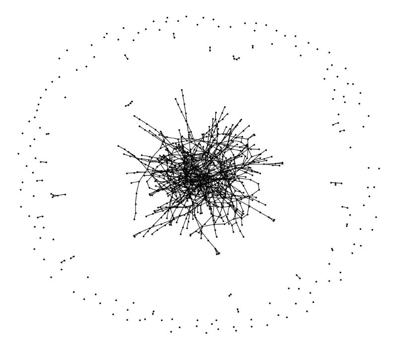
This is a cardinal first principle from graph theory that applies to the real world just as much as abstract dots on a page: the more connections between vertices can exist, the more likely those vertices will all be connected together in some way.
When it comes to viral marketing or pandemics, the availability of connections is the most important feature in society that allows products or diseases to progress from one person or group of persons to the whole. Without those connections, it is as if the virus is quarantined, left to die out within its small component.
There are two graph-based models for epidemics, one is the Susceptible-Infected-Removed (SIR) model where, once infected, a susceptible person is no longer able to be infected and is “removed” from those susceptible. This can happen by immunity or, unfortunately, death. There is a lot of research on this kind of model out there. This is the kind of model where the infection must continually find new populations to avoid dying out and so there is a progression across the graph’s main component. The other model is the Susceptible-Infected-Susceptible (SIS) model. In this model, infected persons can be returned to the susceptible population once they recover so that the epidemic is able to backtrack through previously infected populations. Coronavirus is generally believed to be a SIR kind of pandemic. While there have been reports of people testing positive again after recovery or having relapses, there haven’t been any confirmed cases where a recovered person became sick by reinfection. In reality, many kinds of viruses simply mutate as a way of reinfecting people, but do we count that as a new epidemic or a continuation of the old one? It’s hard to say.
About ten years ago, Cornell mathematics Professor Rick Durrett published a paper in the Proceedings of the National Academy of Science on the use of random graphs to model epidemics. In the late ’80s a gypsy moth infestation in Ithaca, NY inspired him to develop a model for disease spread based on chaos theory. As he tells it, it took a different kind of epidemic to stop the one killing the oak trees in upstate New York:
For all of one summer, my wife and I destroyed egg masses, picked larvae off of trees, and put bands of sticky tape to catch them when they came down at night. When the next summer came, the outlook for the trees seemed bleak, but suddenly all of the larvae were dead, victims of an epidemic of the nuclear polyhedrosis virus.
In his paper, he shows how, because infection is unlikely to happen randomly, by chance to an individual tree but is more likely to spread from tree to tree, only members of the giant component of the graph die.
Likewise, for respiratory viruses, it is highly unusual for a mutant virus to jump from an animal to a person by chance and far more likely to jump from person to person. (This is not true for all epidemics. Some such as the bubonic plague are spread through animal reservoirs such as rats and fleas. Others such as malaria rely on mosquito populations.)
Graph theory only paints a picture of what is important in a real model of course. It can’t tell you what’s going to happen exactly. It can tell you that it is important to reduce the number of connections between people, especially when those people have connections to the sick. As the pandemic progresses through a graph, only a small number of people are infected at any time while, early in the pandemic, there are many susceptible. As “herd immunity” is developed, more people are in the removed category and the links between the infected and the susceptible are blocked off causing the pandemic to die out. For a very, very contagious disease such as measles, the number of removed people has to be very high, up to 99%, which is why vaccination is so critical. For a less contagious disease, like coronavirus or flu, it can be lower, more like 60–70%. Whether people are removed by vaccine or previous infection doesn’t matter though vaccine is obviously preferable.
Graphs can also tell you how an infection might flow through a population and how to backtrack back through the graph to understand the causes of the infection. Contact tracing is a way of trying to construct the real-life graph of the flow of an infection and to snip the edges that connect the infected to the susceptible in a surgical rather than heavy handed way of lockdowns and quarantines.
Ultimately, we cannot and should not eliminate the connections between us, not only because they bring us delicious hot sauces, but because they are the means by which we support, comfort, and relate to one another. It is also the source of innovation and important to our survival that we are able to pass help to where it is needed through the web of interconnections. It is not just word of mouth that traverses the edges of the human graph but love of heart.
“Some features of the spread of epidemics and information on a random graph”, Rick Durrett, Proceedings of the National Academy of Sciences. Mar 2010, 107 (10) 4491–4498; DOI: 10.1073/pnas.0914402107 https://www.pnas.org/content/107/10/4491